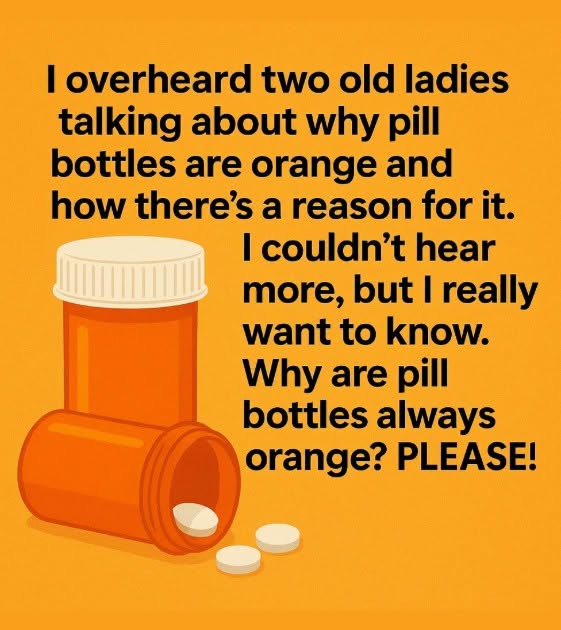
for medications that may be sensitive to light.
And honestly, I love discovering little everyday design choices like this. Something that seems completely ordinary suddenly makes perfect sense once you know the reason behind it.
Why Not Use a Different Color?
This is where things get even more interesting.
If the goal is to protect medication from light, why settle on orange? Why not black, dark blue, or another color?
The appeal of the classic orange bottle comes down to finding a balance between light protection and visibility.
A completely